Hubspot is a powerful marketing tool that helps businesses build their websites, manage customer relationships, and track conversions.
The CMS Hub provides an easy way for users to create content on your website. You can use it to add blog posts, articles, pages, events, or anything else that needs to be added to your site. The CMS Hub also allows you to easily update existing content, as well as delete old content. It's
In this article, I'll show you some examples of websites built using HubSpot's Content Management System (CMS).
|
What is HubSpot? HubSpot is an integrated marketing platform that helps companies scale their business by delivering a best-in-market customer experience. |
Hubspot is a powerful marketing tool that helps businesses build their websites, manage customer relationships, and track conversions.
The CMS Hub provides an easy way for users to create content on your website. You can use it to add blog posts, articles, pages, events, or anything else that needs to be added to your site. The CMS Hub also allows you to easily update existing content, as well as delete old content. It's
In this article, I'll show you some examples of websites built using HubSpot's Content Management System (CMS).
What is HubSpot CMS Hub?
CMS Hub is a robust content management system that creates personalized, high-converting websites. It offers a variety of tools for creating websites, including web hosts, themes, dynamic content creation, drag-and-dropped page editing, and membership platforms. It's built using HubSpot's CRM software. CMS Hub gives you control over your content by allowing you to customize your pages for visitors so they can access the information they need quickly and easily.
It's easy to use and has a good reputation. These valuable tools make it a popular choice among marketers, developers, and business people at small to large enterprises.
Why Build a Website with HubSpot CMS?
There are many similarities between HubSpot and other tools, but it's important to assess which ones fit your specific needs. For example, one advantage of HubSpot has to do with its flexibility without the need for additional bulk.
There are lots of CMS platforms out there, including WordPress, which dominates the market. However, they often come with lots of extra bells and whistles, but there’s always a catch.
The following are just a few examples of sites built with the CMS:
CMS Hub Website Examples
1. Biocair
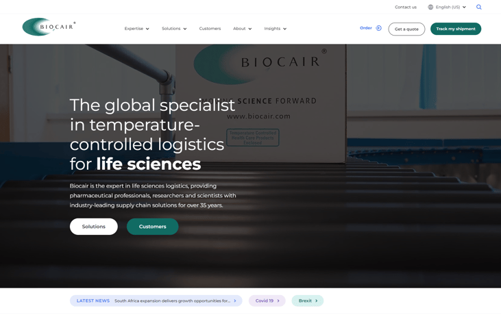
Biocair's site is designed to engage a global audience and is ready to scale into new markets. The brand reflects its international reach, promoting trust and transparency. Bold images and videos give the site an energetic feel, highlighting the company's people and expertise. The site's clean design allows users to find what they're looking for quickly and easily.
A dynamic interactive mapping tool allows users to find local offices within Biocair’s global organization. Using HubDB, the tool can be easily updated by Biocair’s s marketers as they expand their global presence. Smart CTAs display information about the closest regional representative, providing a personalized experience. The inclusion of a language selector ensures that multiple languages can be displayed throughout the site.
2. The Room
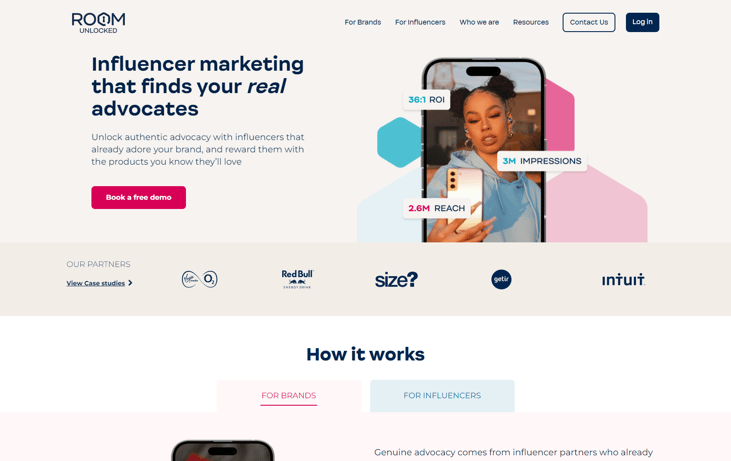
The Room is an online influencer marketing platform that helps connect people with brands they care about. It was created by Blend, a HubSpot Partner digital agency specializing in web design and development. The site has two distinct user journeys: One for brands and another for influencers. Each section has its own landing page, resource library, color scheme, and call to action.
The room's message of finding true romance in authenticity is conveyed through powerful writing, which uses vivid imagery and distinctive fonts to convey the room's unique personality. The vibrant design, which features handwritten typography, animated icons, and distinct shapes, adds character to the brand while maintaining consistency throughout the site.
For example, in “Brands”, the CTA in the “Heroes” section asks for users' input (i.e. booking a demo), but the CTA in “Influencers” allows for applications.
3. Breathe
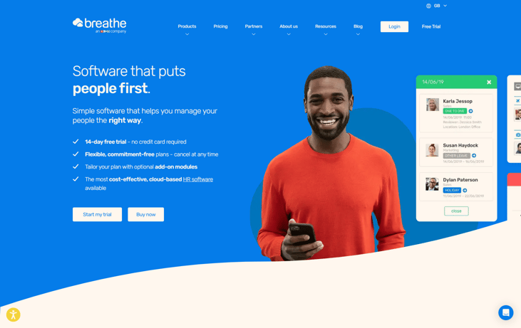
Breathe's site uses HubSpot's advanced features to their fullest extent. Mega Nav Segments allows Breathe to organize its products by category, with clear titles and explanations, so that people can easily browse through them. The website also includes a dynamic filterable partner database that allows users to easily locate the right partners for their business.
A price comparison tool allows users to compare prices for Breathe's software, tailored according to the type of product they need. A portfolio of digital calculators helps to support lead generation through increased engagement.
4. Rhino
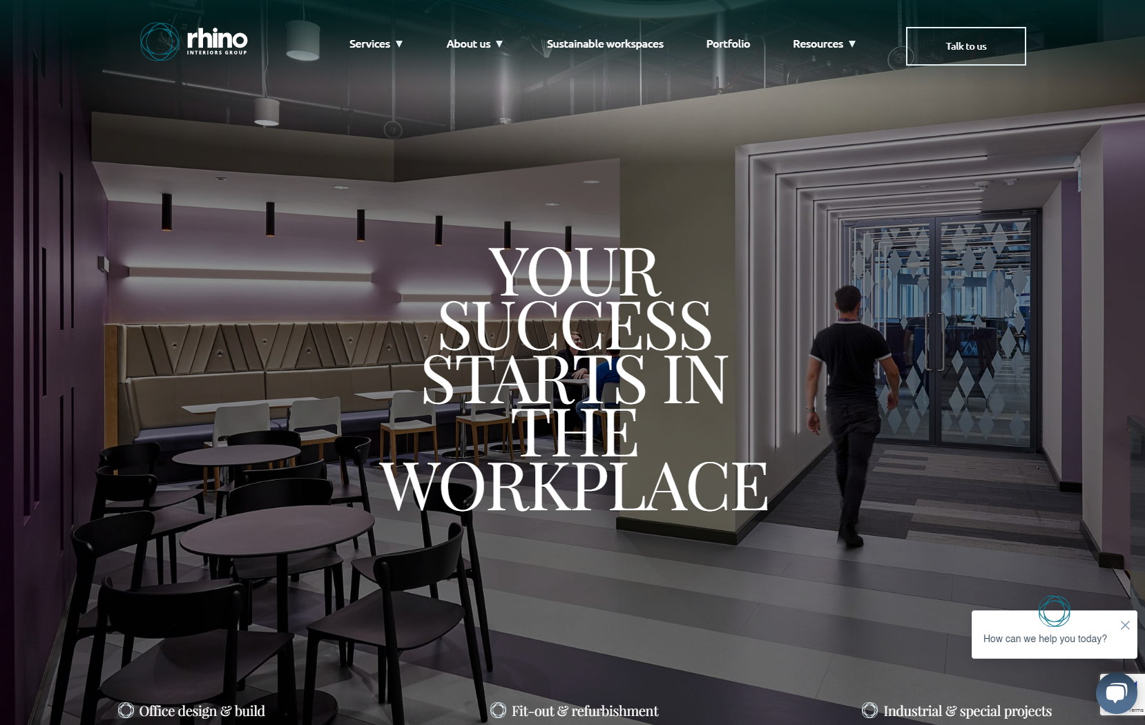
Rhino's site has an impressive design that sets it apart from others. Its homepage features large photos of interiors that draw attention to itself. Visitors can click through to see more details about each room. It has interactive features including hover effects, dioramas that let users zoom in and pan around them, and a sleek and modern look.
5. Caithness Construction
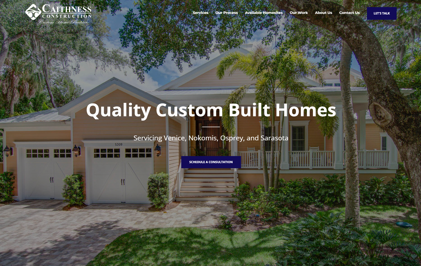
Caithness Construction offers plenty of visual and social proof to encourage website viewers to take action by clicking through to their contact page.
The homepage features high-quality photos of the exteriors and interiors of homes the firm has designed. The website also includes an animated number counter that displays the fact that the builder has been in operation for 25 years and has completed over 400 houses in over 30 communities. Other sections of the site include customer testimonials, awards, an image gallery of custom houses, and four detailed case studies. These elements highlight the quality of Caithness' construction, its professional approach, and its customer service.
We really liked the way Caithness Construction masterly offered proof that it could deliver on its promise of creating a beautiful house.
6. Friedrich
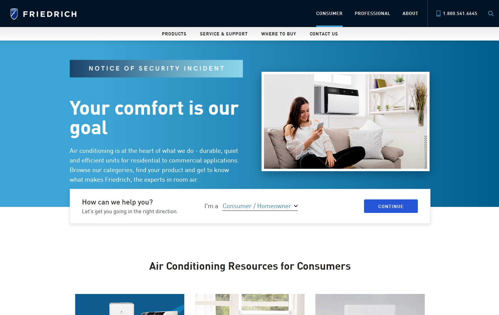
Friedrich makes high-performance air conditioning systems and specialty cooling products for both residential and light commercial applications. The company offers a wide range of options including single-zone units, multi-zone systems, ductless split systems, heat pumps, variable speed fans, evaporative coolers, humidifiers, dehumidifiers, thermostats, sensors, controls, and many others.
It tailors its content to different types of buyers. People can choose from among the six buyer personas in the drop-down list on the homepage. After selecting from the list of sections, the next step is for the page to dynamically change depending on which product category the user selected.
Friedrich helps users identify with one of six different personas, which results in a more streamlined user interface.
7. Coca-Cola Beverages Northeast
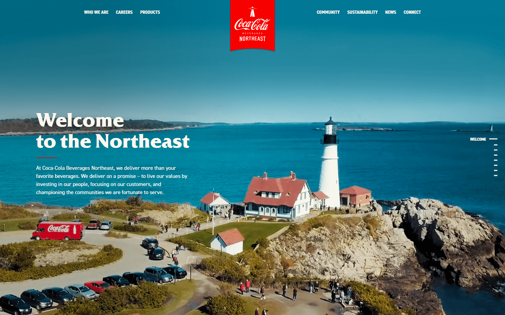
Coca-Cola Beverages Northeast showcases life at Coca‑Cola to draw attention to itself and strengthen its relationship with local customers and resellers.
The website includes information about its local partners, job openings, and its dedication to environmental responsibility. It also features high-quality photos taken on-location with real Coca-Cola Northeast employees and their Instagram accounts.
Coca-Cola’s Northeast has added a neat feature because they’ve made their engagement easy for consumers to see by embedding the Instagram feed and social networking icons.
8. Synlait Swappa Bottle
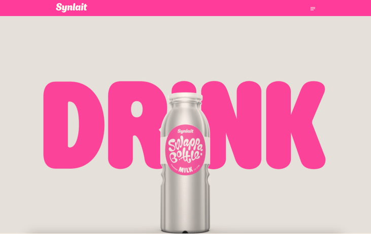
Synlait Milk Ltd is a dairy nutrition company dedicated to sustainable production and innovative products. It has an interactive microsite promoting its first direct-to-consumer product: The Synlait Swappa bottle. Sustainability goals on products should be designed to motivate their customers to get involved and actively participate in the company’s sustainability efforts. To allow participants to find participating stores near them, the website uses a dynamic map element where they can see the nearest ones.
It also integrates QR codes so that people can scan them to learn more about the product. They can then follow the product’s journey, including tracking how many times the bottle has been filled and how many single-use plastic containers it has replaced.
We really liked the Synlait Swappa bottle site because it featured clear, concise, and easy-to-understand content. It had a strong visual design that was easy for visitors to understand, and it provided useful information about how its product helps people live better lives.
Started building with HubSpot CMS website
The CMS Hub websites above show how powerful QR codes, multi-lingual capabilities, dynamic web pages, etc., can be for your marketing and lead generation initiatives. Think about how building or migrating your website to CMS Hub can help you grow faster.
At Fine Media, we are HubSpot Certified Partners. Our team will work with you to determine what type of solution best fits your needs. From there, we'll customize a plan that works specifically for your business.

